
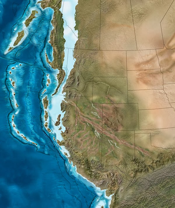
 [Image: The west coast of North America as it appeared roughly 215 million years ago; map by Ron Blakey].
The paleo-tectonic maps of retired geologist Ronald Blakey are mesmerizing and impossible to forget once you’ve seen them. Catalogued on his website Colorado Plateau Geosystems, these maps show the world adrift, its landscapes breaking apart and reconnecting again in entirely new forms, where continents are as temporary as the island chains that regularly smash together to create them, on a timescale where even oceans that exist for tens of millions of years can disappear leaving only the subtlest of geological traces.
With a particular emphasis on North America and the U.S. Southwest—where Blakey still lives, in Flagstaff, Arizona—these visually engaging reconstructions of the Earth’s distant past show how dynamic a planet we live on, and imply yet more, unrecognizable changes ahead.
The following images come from Ron Blakey‘s maps of the paleotectonic evolution of North America. The first map shows the land 510 million years ago, progressing from there—reading left to right, top to bottom—through the accretion and dissolution of Pangaea into the most recent Ice Age and, in the final image, North America in its present-day configuration.
As part of BLDGBLOG’s collaborative side-project, Venue, Nicola Twilley and I met with Blakey in his Flagstaff home to talk about the tectonic processes that make and remake the surface of the Earth, the difficulty in representing these changes with both scientific accuracy and visual panache, and the specific satellite images and software tools he uses to create his unique brand of deep-time cartography.
Like film stills from a 600-million year-old blockbuster, Blakey’s maps take us back to the Precambrian—but there are much older eras still, stretching unmapped into far earlier continents and seas, and there are many more billions of years of continental evolution to come. Blakey talked us through some of the most complex changes in recent geological history, including the opening of the North Atlantic Ocean, and he allowed himself to speculate, albeit briefly, about where Earth’s continental crust might yet be headed (including a possible supercontinent in the Antarctic).
Many of Blakey’s maps are collected in the book Ancient Landscapes of the Colorado Plateau, written with Wayne Ranney, where Blakey also describes some of the research and methods that went into producing them. Blakey also contributed to the recent, new edition of a textbook by Wolfgang Frisch and Martin Meschede, Plate Tectonics: Continental Drift and Mountain Building, a thorough exploration of landscapes disassembling and colliding over vast spans of time.
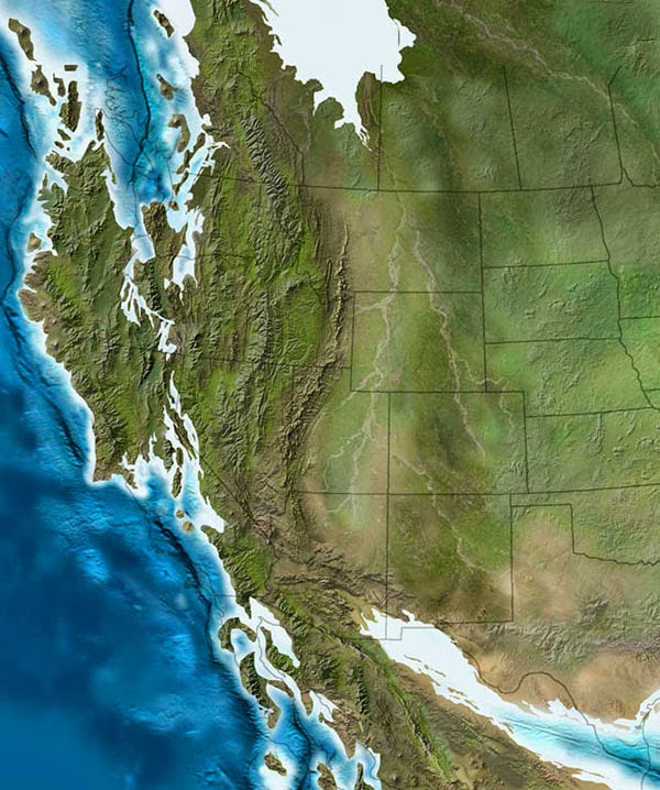 [Image: The west coast of North America, depicted as it would have been 130 million years ago; the coast is a labyrinth of islands, lagoons, and peninsulas slowly colliding with the mainland to form the mountains and valleys we know today. Map by Ron Blakey].
Geoff Manaugh: When I first discovered your maps showing the gradual tectonic re-location of the continents over hundreds of millions of years, I thought this was exactly what geologists should be doing: offering clear, step-by-step visual narratives of the evolution of the earth’s surface so that people can better understand the planet we live on. What inspired you to make the maps, and how did you first got started with them?
Ronald Blakey: Well, the very first maps I made were in conjunction with my doctoral thesis, back in the early 1970s. Those were made with pen and ink. I made sketches to show what the paleogeography would have looked like for the specific formation I was studying with my doctorate. Three or four of those maps went into the thesis, which was then published by the Utah Geologic Survey. I’ve also done a number of papers over the years where I’ve made sketches.
But I was late getting into the computer. Basically, during my graduate work I never used a computer for anything. I kind of resisted it, because, for the kind of work I was doing, I just didn’t see a need for it—I didn’t do quantifiable kinds of things. Then, of course, along comes email and the Internet. I actually forget when I first started with Photoshop—probably in the mid-1990s. When I found that, I just thought, wow: the power of this is incredible. I quickly learned how to use the cloning tool, so that I could clone modern topography onto ancient maps, and that made things even simpler yet.
Another thing I started doing was putting these maps into presentations. There were something like five different programs back there, in the late 90s, but the only one that survived was PowerPoint—which is too bad, because it was far from the best of the programs. I was using a program called Astound, which was far superior, particularly in the transitions between screens. I could do simple animations. I could make the tectonic plates move, create mountain belts, and so forth.
I retired in May of 2009, but all of my early maps are now online. With each generation of maps that I’ve done, there has been a noted improvement over earlier maps. I find new techniques and, when you work with Photoshop as much as I do, you learn new ideas and you find ways to make things that were a little clumsy look more smooth.
Manaugh: Where does the data come from?
Blakey: It comes from various publications. You can get a publication and have that PDF open, showing what something looked like in the past, and work from that. Usually, what I’m working from are fairly simple sketches published in the literature. They’ll show a subduction zone and a series of violent arcs, or a collision zone. What I do is take this information and make it more pictorial.
If you create a series of maps in sequence, you can create them in such a way that certain geologic events, from one time slice to the next, to the next, to the next, will blend. It depends a lot on the scale of what you’re trying to show—the whole world versus just four or five states in the West.
Now, throughout the years from, let’s say, 2004 until I retired in 2009, I kept improving the website. I envisioned most of this as educational material, and I didn’t pay much attention to who used it, how they used it, and so forth. But, then, shortly before I retired, various book companies and museums—and, most recently, oil companies—have approached me. So I started selling these and I tried very diligently not to allow this to overlap with what I was doing for my teaching and my research at the University.
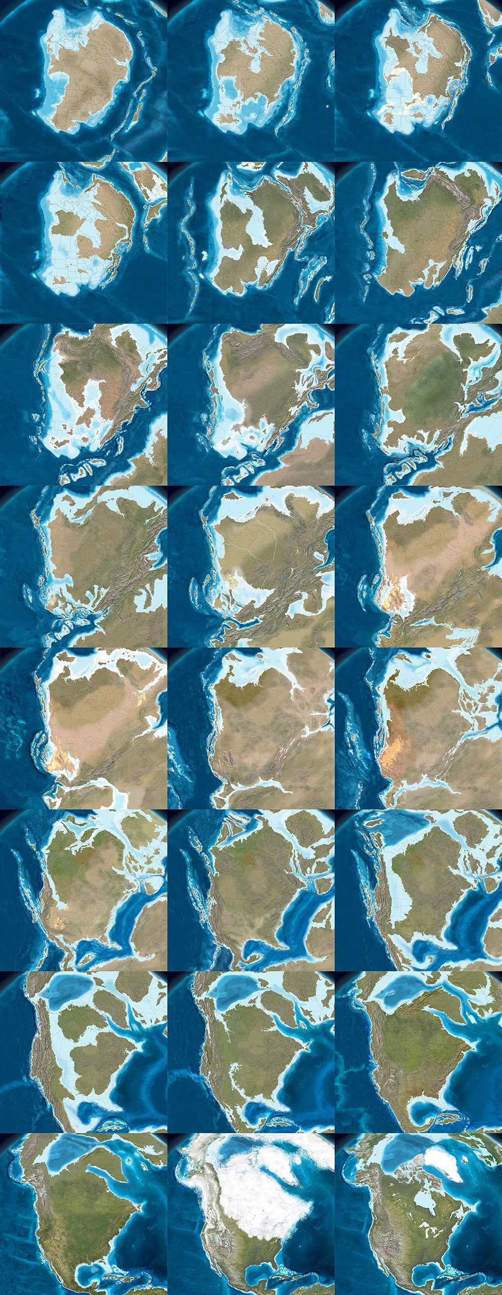
In the following long sequence of images, we see the evolution of the west coast of North America, its state boundaries ghosted in for reference. Sea levels rise and fall; island chains emerge and collide; mountains form; inland seas proliferate and drain; and, eventually, modern day California, Vancouver Island, and the Baja peninsula take shape, among other recognizable features. The time frame represented by these images is approximately 500 million years. All maps by Ron Blakey.

Nicola Twilley: What do the oil companies want them for?
Blakey: They’re my biggest customers now. Usually, the geologists at oil companies are working with people who know either much less geology than they do or, in some cases, almost no geology at all, yet they’re trying to convince these people that this is where they need to explore, or this is what they need to do next.
They find these maps very useful to show what the Devonian of North Dakota looked like, for example, which is a hot spot right now with all the shales that they’re developing in the Williston Basin. What they like is that I show what the area might have really looked like. This helps, particularly with people who have only a modest understanding of geology, particularly the geologic past.
Manaugh: What have been some of the most difficult regions or geological eras to map?
Blakey: The most difficult thing to depict is back in the Paleozoic and the Mesozoic. Large areas of the continent were flooded, deep into the interior.
During certain periods, like the Ordovician, the Devonian, and parts of the Jurassic—especially the Cretaceous—as much as two-thirds of the continents were underwater. But they’re still continents; they’re still continental crusts. They’re not oceans. The sea level was just high enough, with respect to where the landscape was at the time, that the area was flooded. Of course, this is a concept that non-geologists really have problems with, because they don’t understand the processes of how continents get uplifted and subside and erode and so forth, but this is one of the concepts that my maps show quite nicely: the seas coming in and retreating.
But it’s very difficult—I mean, there is no modern analog for a seaway that stretched from the Mackenzie River Delta in Canada to the Gulf of Mexico and that was 400 miles wide. There’s nothing like that on Earth today. But the styles of mountains have not dramatically changed over the last probably two billion years—maybe even longer than that. I don’t go back that far—I tend to stick with the last 600 million years or so—but the styles of mountains haven’t changed. The nature of island arcs hasn’t changed, as far as we know.
What has changed is the amount of vegetation on the landscape. My maps that are in the early part of the Paleozoic—the Cambrian and the Ordovician early part of the Silurian—tend to be drab-colored. Then, in the late Silurian and in the Devonian, when the land plants developed, I start bringing vegetation colors in. I try to show the broad patterns of climate. Not in detail, of course—there’s a lot of controversy about certain paleoclimates. But, basically, paleoclimates follow the same kinds of regimens that the modern climates are following: where the oceans are, where the equator is, where the mountain ranges are, and so forth.
That means you can make broad predictions about what a paleoclimate would have been based on its relationship to the equator or based on the presence or absence of nearby mountains. I use these kinds of principles to show more arid areas versus more humid areas.
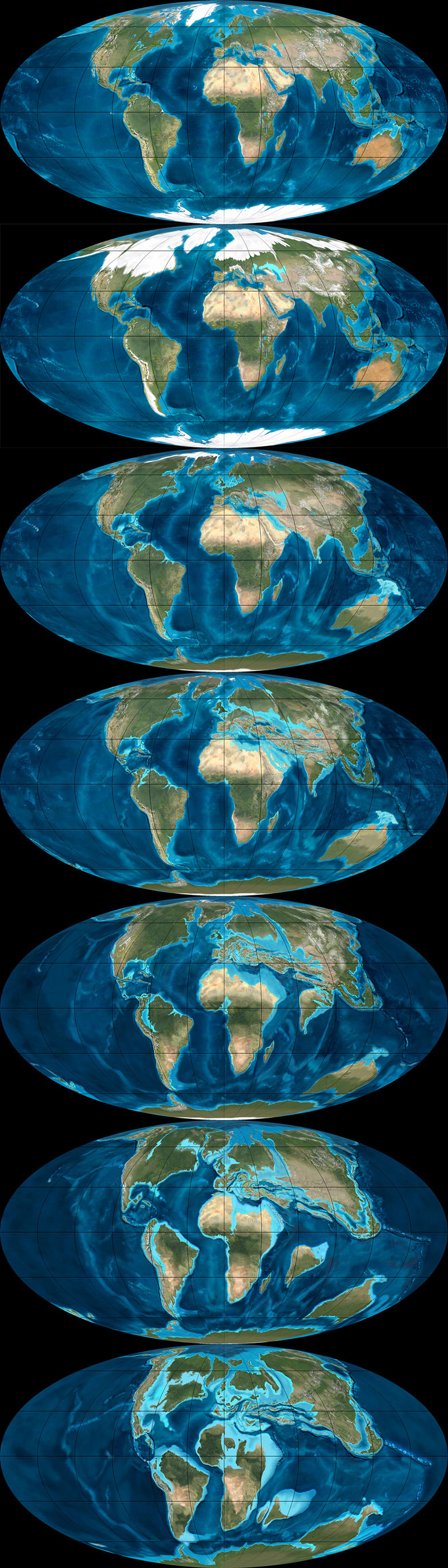
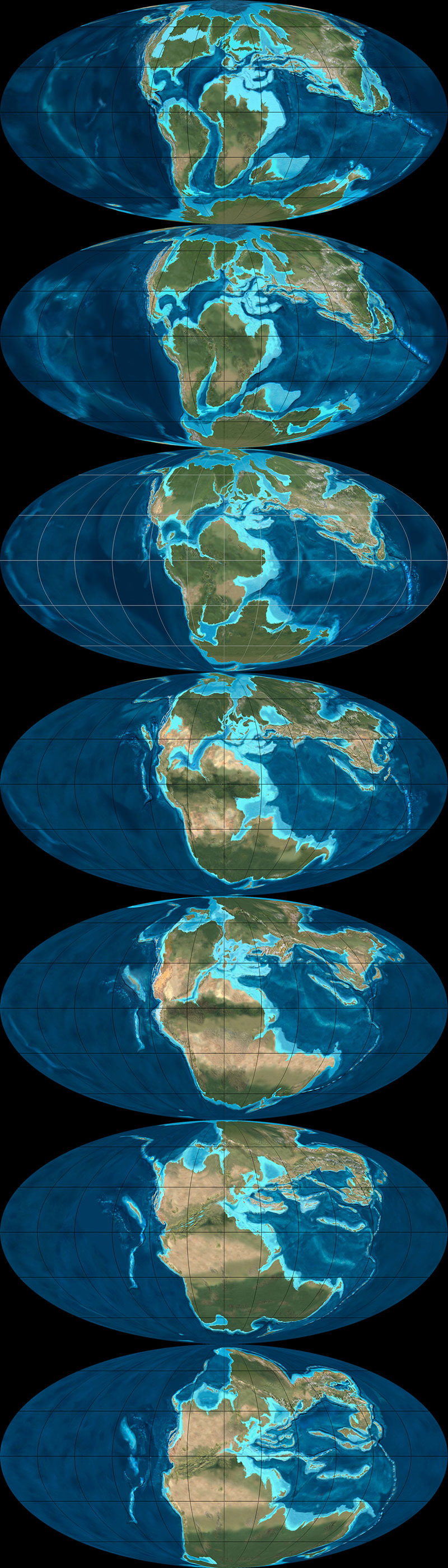
The next three sequences show the evolution of the Earth’s surface in reverse, from the present day to, at the very bottom, 600 million years ago, when nearly all of the planet’s landmasses were joined together in the Antarctic. The first sequence shows roughly 90 million years of backward evolution, the continents pulling apart from one another and beginning a slow drift south. They were mapped using the Mollweide projection, and, in all cases, are by Ron Blakey.
Twilley: And you paint the arid area based on a contemporary analog?
Blakey: Right. I know the modern world reasonably well and I’ll choose something today that might have matched the texture and aridity of that older landscape.
I use a program called GeoMapApp that gives me digital elevation maps for anywhere in the world. Most recently, they have coupled it with what they call the “Blue Marble.” NASA has stitched together a bunch of satellite photos of the world in such a way that you can’t tell where one series of photos come in or another. It’s a fairly true-color representation of what Earth would look like from space. So this Blue Marble is coupled with the GeoMapApp’s digital elevation topography; you put the Blue Marble over it, and you use a little slider to let the topography show through, and it gives you a fairly realistic looking picture of what you’re looking for.
For example, if I’m working with a mountain range in the southern Appalachians for a Devonian map—well, the southern Appalachians, during the Devonian, were probably far enough away from the equator that it was in the arid belt. There are some indications of that, as well—salt deposits in the Michigan Basin and in parts of New York and so forth. Plus, there are red-colored sediments, which don’t prove but tend to indicate arid environments. This combination tells me that this part of the world was fairly arid. So I’m going to places like modern Afghanistan, extreme western China, northern Turkey, or other places where there are somewhat arid climates with mountain belts today. Then I clone the mountains from there and put them in the map.
But you have to know the geologic background. You have to know how the mountains were formed, what the grain of the mountains was. That’s not always easy, although there are ways of doing it. To know the grain of the mountains, you need to know where the hinterland and the center of the mountains were. You need to know where the foreland area is, so that you can show the different styles of mountains. You have to move from foreland areas—which tends to be a series of parallel ridges, usually much lower than the hinterlands—to the center and beyond.
I use this kind of information to pick the right kind of modern mountain to put back in the Devonian, based on what that Devonian landscape probably had a good chance of looking like. Do we know for certain? Of course not. We weren’t around in the Devonian. But we have a good rock record and we have a lot of information; so we use that information and, then, voilà.
To give another example, let’s look at the Devonian period of the east coast. The big European continent that we call Baltica collided with Greenland and a series of micro-continents collided further south, all the way down at least as far as New Jersey, if not down as far the Carolinas. We know that there are places on Earth today where these same kinds of collisions are taking place—in the Alps and Mediterranean region, and the Caucasus region, and so forth.
We can use the concept that, if two plates are colliding today to produce the Caucasus mountains, and if we look at the style of mountains that the Caucasus are, then it’s reasonable to think that, where Greenland and Baltica collided in the Silurian and the Devonian, the mountains would have had a similar style. So we can map that.
This second sequence shows the continents drifting apart, in reverse, from 105 million years ago to 240 million years ago. They were mapped using the Mollweide projection, and, in all cases, are by Ron Blakey.
Manaugh: That collision alone—Baltica and Greenland—sounds like something that would be extremely difficult to map.
Blakey: Absolutely. And it’s not a one-to-one relationship. You have to look at the whole pattern of how the plates collided, how big the plates were, and so forth.
Then there’s the question of the different histories of particular plates. So, for example, most of Scotland started out as North America. Then, when all the continents collided to form Pangaea, the first collisions took place in the Silurian-Devonian and the final collisions took place in the Pennsylvanian-Permian. By, say, 250 million years ago, most of the continents were together. Then, when they started to split apart in the Triassic and Jurassic—especially in the Triassic and Cretaceous—the split occurred in such a way that what had been part of North America was actually captured, if you will, by Europe and taken over to become the British Isles.
Scotland and at least the northern half of Ireland were captured and began to drift with Europe. On the other hand, North America picked up Florida—which used to be part of Gondwana—and so forth.
One of the things that is interesting is the way that, when mountains come together and then finally break up, they usually don’t break up the same way that they came together. Sometimes they do, but it has to do with weaknesses, stress patterns, and things like this. Obviously, all time is extremely relative, but mountains don’t last that long. A given mountain range that’s been formed by a simple collision—not that there’s any such thing as a simple collision—once that collision is over with, 40 or 50 million years after that event, there is only low-lying landscape. It may have even have split apart already into a new ocean basin.
But here’s the important part: the structure that was created by that collision is still there, even though the mountains have been worn down. It’s like when you cut a piece of wood: the grain is still inherited from when that tree grew. The pattern of the grain still shows where the branches were, and the direction of the tree’s growth in response to wind and sun and its neighbors. You can’t reconstruct the tree exactly from its grain, but, if you’re an expert with wood, you should be able to look and say: here are the tree rings, and here’s a year where the tree grew fast, here’s a year where the tree grew slow, here’s where the tree grew branches, etc.
In a sense, as geologists, we’re doing the same things with rock structure. We can tell by the pattern of how the rocks are deformed which direction the forces came from. With mountains, you can tell the angle at which the plates collided. It’s usually very oblique. What that tends to do is complicate the geologic structure, because you not only get things moving one way, but you get things dragging the other way, as well. But we can usually tell the angle at which the plates hit.
Then, in many cases, based upon the nature of how the crust has been deformed and stacked up, we can tell the severity of the mountain range. It doesn’t necessarily mean that we can say: oh, this structure would have been a twenty-thousand-foot high mountain range. It’s not that simple at all, not least of which because rocks can deform pretty severely without making towering mountains.
This final of the three global sequences shows the continents drifting apart, in reverse, from 260 million years ago to 600 million years ago. There was still nearly 4 billion years of tectonic evolution prior to where these maps begin. They were mapped using the Mollweide projection, and, in all cases, are by Ron Blakey.

Manaugh: Are you able to project these same tectonic movements and geological processes into the future and show what the earth might look like in, say, 250 million years?
Blakey: I’ve had a number of people ask me about that, so I did make some global maps. I think I made six of them at about 50-million-year intervals. For the fifteen to 100-million-year range, I think you can say they are fairly realistic. But, once you get much past 75 to 100 million years, it starts to get really, really speculative. The plates do strange things. I’ll give you just a couple of quick examples.
The Atlantic Ocean opened in the beginning of the Jurassic. The actual opening probably started off the coasts of roughly what is now Connecticut down to the Carolinas. That’s where the first opening started. So the central part of the Atlantic was the first part to open up. It opened up reasonably simply—but, again, I’m using the word simple with caution here.
The north Atlantic, meanwhile, didn’t open up until about 60 to 50 million years ago. When it opened up, it did a bunch of strange things. The first opening took place between Britain and an offshore bank that’s mostly submerged, called Rockall. Rockall is out in the Atlantic Ocean, northwest of Ireland—near Iceland—but it’s continental crust. That splitting process went on for, let’s say, ten million years or so—I’m just going to talk in broad terms—as the ocean started opening up.
Then the whole thing jumped. A second opening began over between Greenland and North America, as Greenland and North America began to separate off. That lasted for a good 40 or 50 million years. That’s where you now get the Labrador Sea; that is actual ocean crust. So that was the Atlantic Ocean for thirty or forty million years—but then it jumped again, this time over between Greenland and what is now the west coast of Europe. It started opening up over there, before it jumped yet again. There’s an island in the middle of the North Atlantic, way the heck up there, called Jan Mayen. At one time, it was actually part of Greenland. The Atlantic opened between it and Greenland and then shifted to the other side and made its final opening.
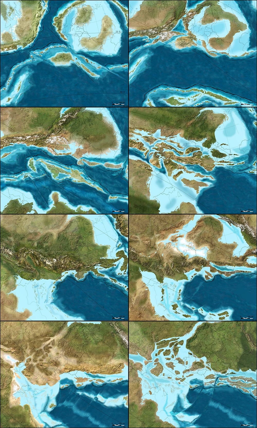
The following two sequences show the evolution of Europe from an Antarctic archipelago to a tropical island chain to the present day Europe we know and recognize. The first sequence starts roughly 450 million years ago and continues to the Jurassic, 200 million years ago. All maps by Ron Blakey.
So it’s very complicated. And that’s just the Atlantic Ocean.
The Northern Atlantic took at least five different paths before the final path was established, and it’s all still changing. In fact, the south Atlantic is actually even worse; it’s an even bigger mess. You’ve got multiple openings between southwest Africa and Argentina, plus Antarctica was up in there before it pulled away to the south.
These complications are what makes this stuff so interesting. If we look at events that we can understand pretty well over the last, let’s say, 150 or 200 million years of time—where we have a good indication of where the oceans were because we still have ocean crusts of that age—then we can extrapolate from that back to past times when oceans were created and destroyed. We can follow the rules that are going on today to see all of the oddities and the exceptions and so forth.
These are the kinds of things I try to keep track of when I’m making these maps. I’m always asking: what do we know? Was it a simple pull-apart process? There are examples where continents started to split across from one another, then came back together, then re-split in a different spot later on. That’s not just speculation—there is geologic evidence for this in the rock record.
So, when it comes to extrapolating future geologies, things become very complicated very quickly. If you start thinking about the behavior of the north Atlantic, creating a projection based on what’s going on today seems, at first, like a fairly simple chore. North America is going on a northwesterly path at only one or two centimeters a year. Europe is moving away, at almost a right angle, at about another centimeter a year. So the Atlantic is only opening at three centimeters a year; it’s one of the slowest-opening oceans right now.
OK, fine—but what else is happening? The Caribbean is pushing up into the Atlantic and, off South America, there is the Scotia Arc. Both of those are growing. They’ve also identified what looks like a new island arc off the western Mediterranean region; that eventually would start to close the Atlantic in that area. Now you start to speculate: well, these arcs will start to grow, and they’ll start to eat into the oceans, and subduct the crusts, and so forth.
Again, for the first 50, 75, or even 100 million years, you can say that these particular movements are fairly likely. But, once you get past that, you can still use geologic principles, but you’re just speculating as to which way the continents are going to go.
For instance, the one continent that does not seem to be moving at all right now, relative to anything else, is Antarctica. It seems to be really fixed on the South Pole. That’s why some people think that everything will actually coagulate back towards the South Pole. However, there are also a bunch of subduction zones today along southern Asia, and those are pretty strong subduction zones. Those are the ones that created the big tsunami, and all the earthquakes off of Indonesia and so forth. Eventually, those could pull either parts of Antarctica or all of Antarctica up toward them.
But I’m more interested in reconstructing the past than I am the future, so I’ve only played around with those five or six maps.
This second sequence, showing the next phase in the evolution of Europe, begins approximately 150 million years ago and extends to the present day. All maps by Ron Blakey.
Manaugh: To ground things a bit, we’re having this conversation in Flagstaff, on the Colorado Plateau, which seems like a great place to teach geology. I wonder whether there might be another Colorado Plateau, so to speak, elsewhere in the world—something geologically similar to the extraordinary landscapes we see here that just hasn’t had the chance to emerge. Maybe the tectonics aren’t right, and it’s still just a crack, rather than a canyon, or maybe it’s covered in vegetation or ice so we can’t see it yet. Conversely, I’m curious if you might have found evidence of other great geological districts in the earth’s past—lost Grand Canyons, other Arches National Parks—that have been lost to time. How could we detect those, and where are they?
Blakey: This is indeed a great place to teach geology. It’s a great place to live.
As for Colorado Plateau analogs—it’s an interesting question. There’s an area in South America that I’d say is fairly similar. It’s got a couple of famous national parks that I can’t remember the name of. It’s a smaller version, but it’s very similar to the Colorado Plateau. It’s between the Andes and the Amazon basin, part of the general pampas region there of South America. It even has similarly aged rocks. Parts of northern Africa would also be similar.
But you have to look at all the characteristics of the Plateau. Number one: the rocks are flat. Number two: the rocks have been uplifted. Number three: the rocks are dissected by a major river system. Number four: it’s a semi-arid climate. There are probably five or six defining characteristics in total, and I’ve heard many people say that there is no other place else on Earth that has all those characteristics in exactly the same way. But I went to an area in eastern Mauritania many years ago, where, for all the world, it looked like the Grand Canyon. It wasn’t as colorful, but it was a big, deep canyon.
In fact, the Appalachian Plateau would be somewhat similar, except it’s in a humid climate, which means the land has been shaped and formed differently. But the Appalachian plateau has flat-lying rocks; it’s dissected by some major rivers; it’s experienced uplift; and so forth.
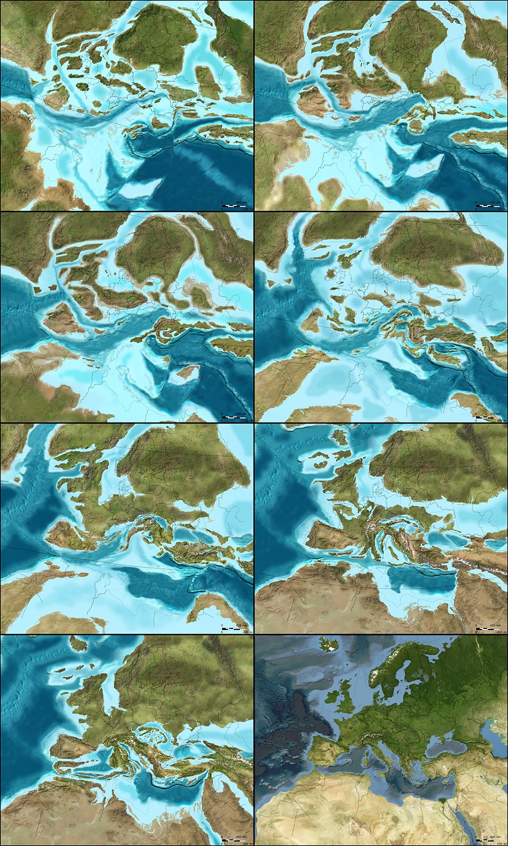
The next two sequences of images, followed from left to right, top to bottom, illustrate the gradual evolution of the Colorado Plateau, where, in its modern day incarnation, this interview with Ron Blakey took place (specifically, in Flagstaff, Arizona. The earliest map included here depicts the Proterozoic; the first sequence ends in the Triassic. All maps by Ron Blakey.

Twilley: I’m interested in the representational challenges you face when you decide to make a map, and, specifically, when you’re in Photoshop, what your most-used tools might be. I thought it was fascinating when you said that the cloning tool really changed how you make geological maps. What other techniques are important to you, in order to represent geological histories?
Blakey: Oh, the cloning tool is the most important, by far—at least when I’m actually painting. Of course, I use the outline tool to select areas, but, when I’m actually painting, it would be impossible to paint these different maps pixel by pixel. I couldn’t do it. Occasionally, I will actually hand-draw some things in the flatlands, where I want to put a river system, for example, but, at least for mountains and rugged terrain, I clone everything.
Some times, I’ll cut and paste. I’ll select an area in the GeoMapApp, I save it as a JPEG, and then I can select it and copy it and paste it in, and I can rotate and deform it a little bit. Are you familiar with the warp tool in Photoshop? I use that a lot, because you can change the shape of mountains a little. If you do it too dramatically, it really looks flaky. But, if you do it right, it still looks pretty realistic.
This second sequence, also showing the evolution of the Colorado Plateau, begins with the Triassic and ends roughly 5 million years ago—basically the present day, in geological terms. All maps by Ron Blakey.

Twilley: And do you have certain filters you rely on for particular geological effects?
Blakey: A little bit. I like to use the craquelure filter. It actually gives you little bumps and valleys and so forth. I use that especially for continental margins. Continental margins are anything but regular slopes, going down to the abyssal depths. They’re very irregular. There are landslides and all kinds of things going on there at the margins, so I add a little texture with craquelure.
It can be difficult to use, though, and it doesn’t work at really high resolutions—so, what I actually have to do some times, is that I will actually copy a part of my map, take it out, make it smaller, do the craquelure on it, and then blow it back up and paste it in again.
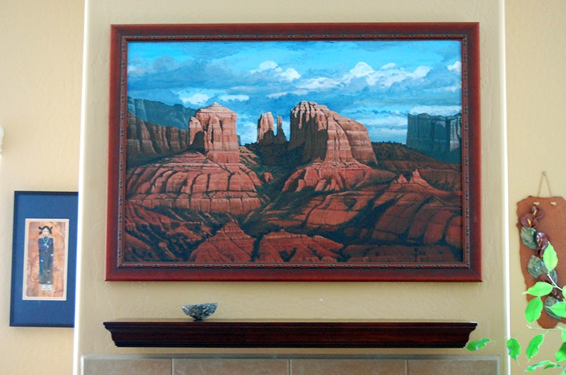 [Image: A painting by Ron Blakey depicts a geological landscape near Sedona, Arizona].
Dee Blakey, Ron’s Wife: I think the other reason that he can do what he does is that he paints. That’s one of his paintings over there. [gestures above fireplace]
Blakey: Well, I guess I should have said that right away, when you asked me why I got interested in this, because I am interested in the artistic aspect of geology. The artistic aspect of science, in general, but especially geology. Astronomy, for example, would be another field where artistic visualizations are useful—any time you’re trying to show things that can’t easily be visualized with something comparable here on present-day planet Earth, you have to use an artistic interpretation.
Anyway, I can’t explain it, but I understand color pretty well. I use the hue saturation tool a lot. I’ll select an area and then I’ll feather it, let’s say, because you don’t want the edges to be sharp. I’ll feather it by thirty, forty, fifty pixels. Then I’ll take the slider for hue saturation, where, if you go to the left, you make things redder and, if you go to the right, you make things greener. If I’ve got a landscape that looks a little too humid, I’ll just slide it slightly to the left to make it a bit redder. You can also change the lightness and darkness when you do that. There’s also regular saturation. By killing the saturation, you can really kill the nature of a landscape quite a bit.
And I use hue saturation a lot. That took me a long time to master, because it’s really easy to screw things up with that tool. You start sliding things a little too far and, whoa—wait a minute! All of a sudden, you’ve got purple mountains.
For more Venue interviews, be sure to stop by the Venue website.
Good stuff, just a shame the set of images of future tectonic movement weren't posted!