
 [Image: A curb in Hayward reveals how much the ground is drifting due to “fault creep”: the red-painted part is slowly, but relentlessly, moving north. Photo by Geoff Manaugh].
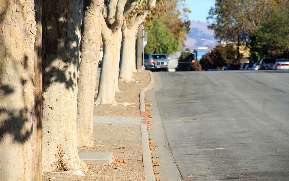
South of San Francisco, a whole town is being deformed by plate tectonics. These are the slow but relentless landscape effects known as “fault creep.”
The signs that something’s not right aren’t immediately obvious, but, once you see them, they’re hard to tune out.
Curbs at nearly the exact same spot on opposite sides of the street are popped out of alignment. Houses too young to show this level of wear stand oddly warped, torqued out of synch with their own foundations, their once strong frames off-kilter. The double yellow lines guiding traffic down a busy street suddenly bulge northward—as if the printing crew came to work drunk that day—before snapping back to their proper place a few feet later.
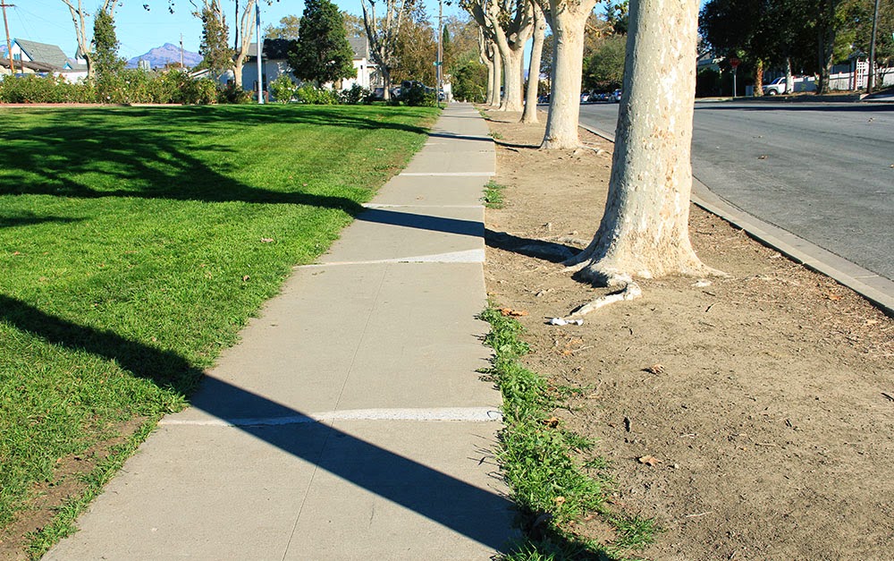
This is Hollister, California, a town being broken in two slowly, relentlessly, and in real time by an effect known as “fault creep.” A surreal tide of deformation has appeared throughout the city.
 [Image: “Fault creep” bends the curbs in Hollister; photo by Geoff Manaugh].
As if its grid of streets and single-family homes was actually built on an ice floe, the entire west half of Hollister is moving north along the Calaveras Fault, leaving its eastern streets behind.
In some cases, doors no longer fully close and many windows now open only at the risk of getting stuck (some no longer really close at all).
Walking through the center of town near Dunne Park offers keen observers a hidden funfair of skewed geometry.
 [Image: 359 Locust Avenue, Hollister; photo by Geoff Manaugh].
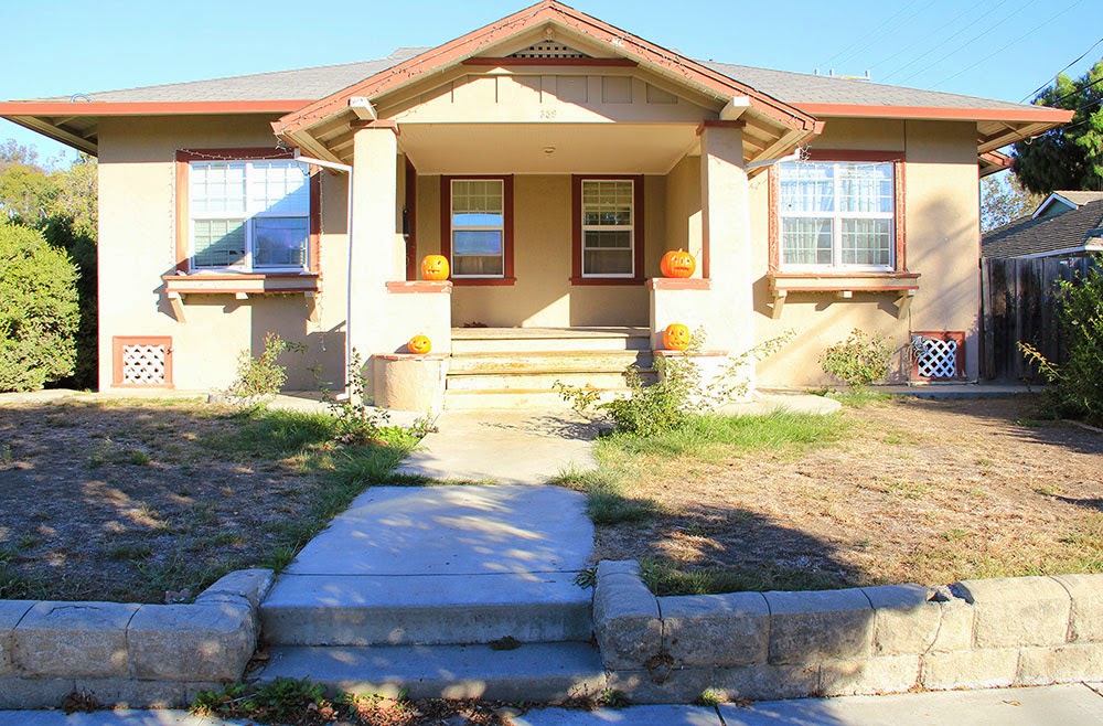
For example, go to the house at 359 Locust Avenue.
The house itself stands on a different side of the Calaveras Fault than its own front walkway. As if trapped on a slow conveyor built sliding beneath the street, the walk is being pulled inexorably north, with the effect that the path is now nearly two feet off-center from the porch it still (for the time being) leads to.
 [Image: The walkway is slowly creeping north, no longer centered with the house it leads to; photo by Geoff Manaugh].
In another generation, if it’s not fixed, this front path will be utterly useless, leading visitors straight into a pillar.
Or walk past the cute Victorian on 5th Street. Strangely askew, it seems frozen at the start of an unexpected metamorphosis.
 [Image: Photo by Geoff Manaugh].
Geometrically, it’s a cube being forced to become a rhomboid by the movements of the fault it was unknowingly built upon, an architectural dervish interrupted before it could complete its first whirl.
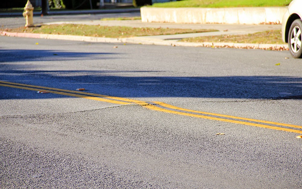
Now look down at your feet at the ridged crack spreading through the asphalt behind you, perfectly aligned with the broken curbs and twisted homes on either side.
This is the actual Calaveras Fault, a slow shockwave of distortion forcing its way through town, bringing architectural mutation along with it.
 [Images: The Calaveras Fault pushes its way through Hollister; photos by Geoff Manaugh].
The ceaseless geometric tumult roiling just beneath the surface of Hollister brings to mind the New Orleans of John McPhee, as described in his legendary piece for The New Yorker, “Atchafalaya.”
There, too, the ground is active and constantly shifting—only, in New Orleans, it’s not north or south. It’s up or down. The ground, McPhee explains, is subsiding.
“Many houses are built on slabs that firmly rest on pilings,” he writes. “As the turf around a house gradually subsides, the slab seems to rise.” This leads to the surreal appearance of carnivalesque spatial side-effects, with houses entirely detached from their own front porches and stairways now leading to nowhere:
Where the driveway was once flush with the floor of the carport, a bump appears. The front walk sags like a hammock. The sidewalk sags. The bump up to the carport, growing, becomes high enough to knock the front wheels out of alignment. Sakrete appears, like putty beside a windowpane, to ease the bump. The property sinks another foot. The house stays where it is, on its slab and pilings. A ramp is built to get the car into the carport. The ramp rises three feet. But the yard, before long, has subsided four. The carport becomes a porch, with hanging plants and steep wooden steps. A carport that is not firmly anchored may dangle from the side of a house like a third of a drop-leaf table. Under the house, daylight appears. You can see under the slab and out the other side. More landfill or more concrete is packed around the edges to hide the ugly scene.
Like McPhee’s New Orleans, Hollister is an inhabitable catalog of misalignment and disorientation, bulging, bending, and blistering as it splits right down the middle.
And there’s more. Stop at the north end of 6th Street, for example, just across from Dunne Park, and look back at the half-collapsed retaining wall hanging on for dear life in front of number 558.
It looks like someone once backed a truck into it—but it’s just evidence of plate tectonics, the ground bulging northward without regard for bricks or concrete.
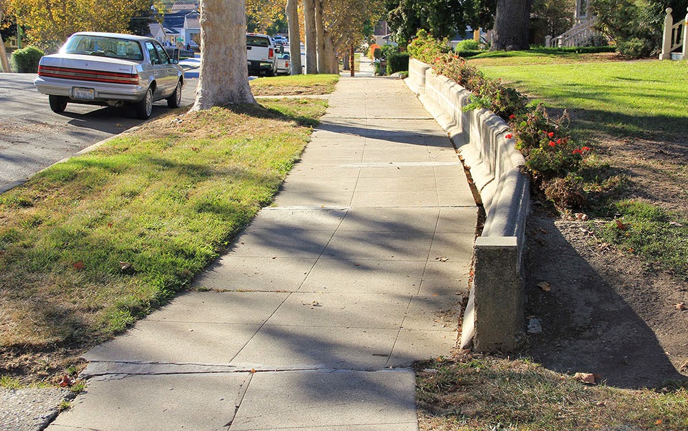
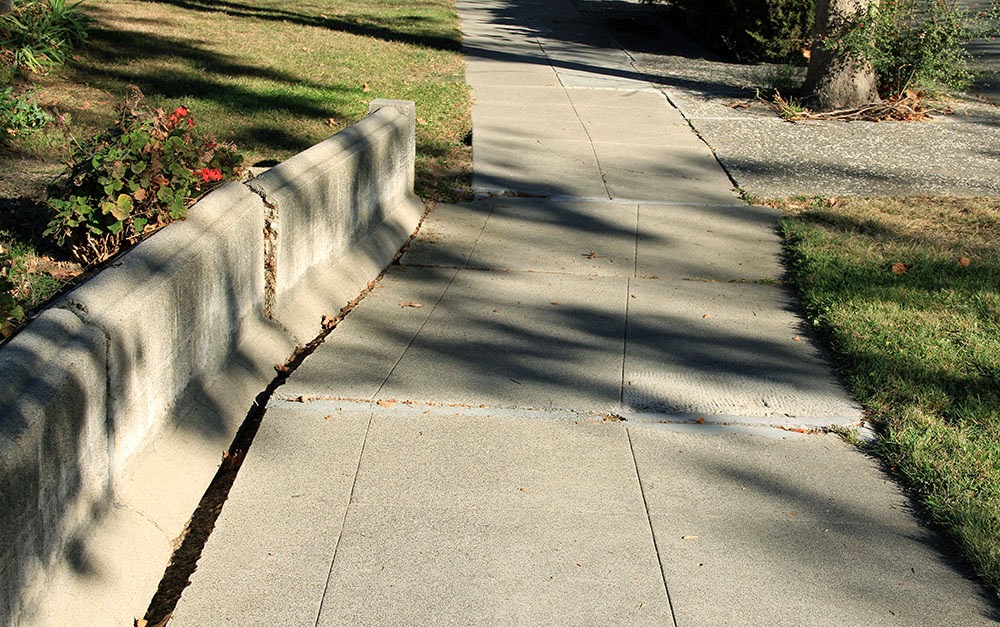 [Images: A fault-buckled wall and sidewalk bearing traces of planetary forces below; photos by Geoff Manaugh].
In fact, follow this north on Google Maps and you’ll find a clean line connecting this broken wall to the jagged rupture crossing the street in the photographs above, to the paper-thin fault dividing the house from its own front walk on Locust Avenue.
So what’s happening to Hollister?
“Fault creep” is a condition that results when the underlying geology is too soft to get stuck or to accumulate tectonic stress: in other words, the deep rocks beneath Hollister are slippery, more pliable, and behave a bit like talc. Wonderfully but unsurprisingly, the mechanism used to study creep is called a creepmeter.
The ground sort of oozes past itself, in other words, a slow-motion landslide at a pace that would be all but imperceptible if it weren’t for the gridded streets and property lines being bent out of shape above it.
 [Image: A curb and street drain popped far out of alignment in Hollister; photo by Geoff Manaugh].
In a sense, Hollister is an urban-scale device for tracking tectonic deformation: attach rulers to its porches and curbs, and you could even take measurements.
The good news is that the large and damaging earthquakes otherwise associated with fault movement—when the ground suddenly breaks free every hundred years or so in a catastrophic surge—are not nearly as common here.
Instead, half a town can move north by more than an inch every five years and all that most residents will ever feel is an occasional flutter.
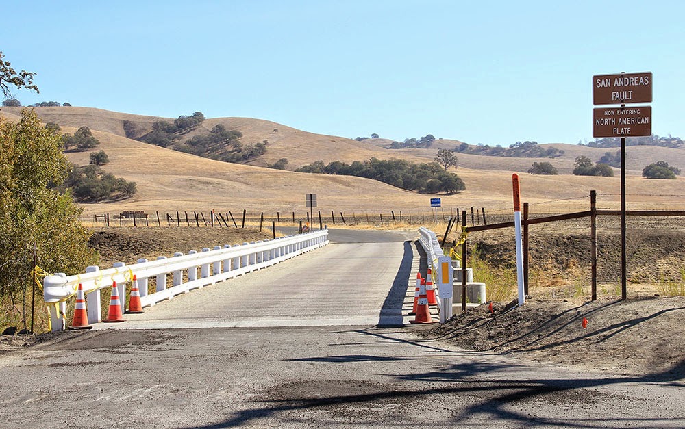
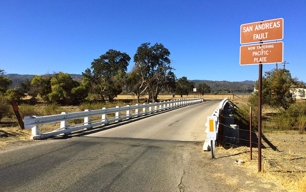 [Images: Crossing onto the Pacific Plate (heading west) in Parkfield; photo by Geoff Manaugh].
I spoke with Andy Snyder from the U.S. Geological Survey about the phenomenon.
Snyder works on an experiment known as the San Andreas Fault Observatory at Depth, or SAFOD, which has actually drilled down through the San Andreas Fault to monitor what’s really happening down there, studying the landscape from below through sensitive probes installed deep in the active scar tissue between tectonic plates.
On Snyder’s advice, I made my way out to one of the greatest but most thoroughly mundane monuments to fault creep in the state of California. This was in Parkfield, a remote town with a stated population of 18 where Snyder and SAFOD are both based, and where fault creep is particularly active.
In Parkfield there is a remarkable road bridge: a steel structure that has been anchored to either side of the San Andreas Fault like a giant, doomed staple. Anyone who crosses it in either direction is welcomed onto a new tectonic plate by friendly road signs—but the bridge itself is curiously bent, warped like a bow as its western anchorage moves north toward San Francisco.
It distorts more and more every day of the month, every year, due to the slow effects of fault creep. Built straight, it is already becoming a graceful curve.
 [Image: Looking east at the North American Plate in Parkfield; photos by Geoff Manaugh].
Parkfield is also approximately where fault creep begins in the state, Snyder explained, marking the southern edge of a zone of tectonic mobility that extends up roughly to Hollister and then begins again on a brief stretch of the Hayward Fault in the East Bay.
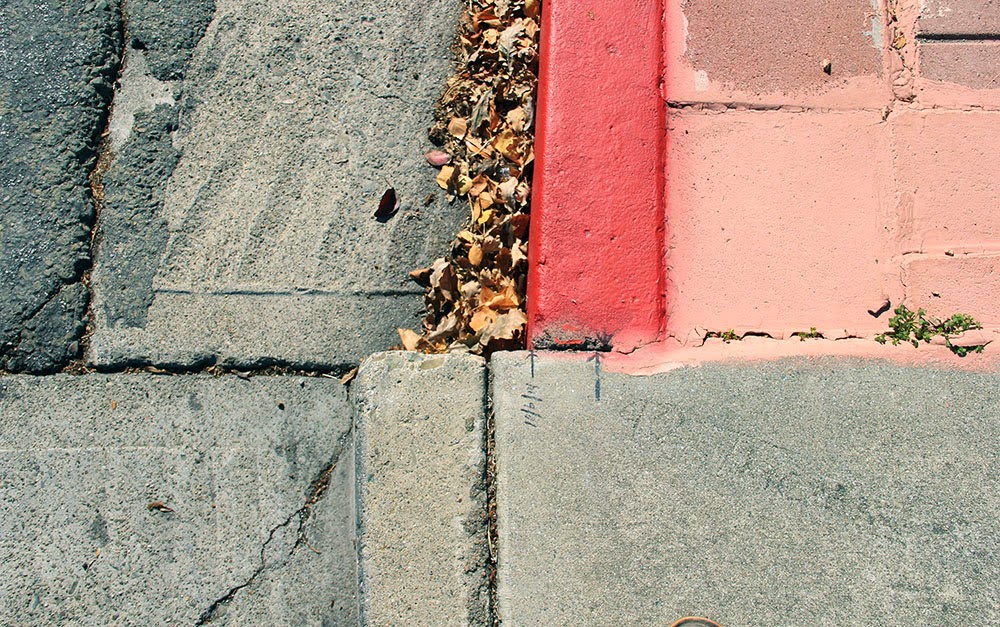
Indeed, another suggestion of Snyder’s was that I go up to visit a very specific corner in the city of Hayward, where the curb at the intersection of Rose and Prospect Streets has long since been shifted out of alignment.
Over the past decade—most recently, in 2011—someone has actually been drawing little black arrows on the concrete to help visualize how far the city has drifted in that time.
The result is something like an alternative orientation point for the city, a kind of seismic meridian—or perhaps doomsday clock—by which Hayward’s ceaseless cleaving can be measured.

 [Images: A moving curb becomes an inadvertent compass for measuring seismic energy in Hayward; photos by Geoff Manaugh].
Attempting to visualize earthquakes on a thousand-year time span, or to imagine the pure abstraction of seismic energy, can be rather daunting; this makes it all the more surprising to realize that even the tiniest details hidden in plain sight, such as cracks in the sidewalk, black sharpie marks on curbs, or lazily tilting front porches, can actually be real-time evidence that California is on the move.
But it is exactly these types of signs that function as minor landmarks for the seismic tourist—and, for all their near-invisibility, visiting them can still provide a mind-altering experience.
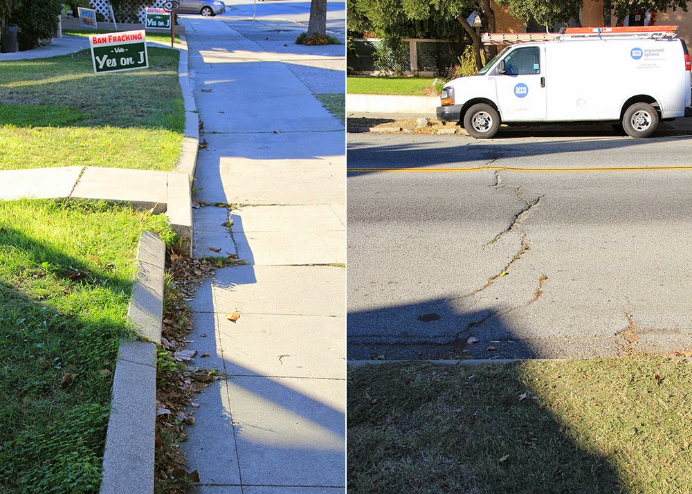
Back in Hollister, Snyder warned, many of these already easily missed signs through which fault creep is made visible are becoming more and more hard to find.
The town is rapidly gentrifying, he pointed out, and Hollister’s population is beginning to grow as its quiet and leafy streets fill up with commuters who can no longer afford to live closer to Silicon Valley or the Bay. This means that the city’s residents are now just a bit faster to repair things, just a bit quicker to tear down structurally unsound houses.
One of the most famous examples of fault creep, for example—a twisted and misshapen home formerly leaning every which way at a bend in Locust Avenue—is gone. But whatever replaces it will face the same fate.
After all, the creep is still there, like a poltergeist disfiguring things from below, a malign spirit struggling to make itself visible.
Beneath the painted eaves and the wheels of new BMWs, the landscape is still on the move; the deformation is just well hidden, a denied monstrosity reappearing millimeter by millimeter despite the quick satisfaction of weekend repair jobs. Tumid and unstoppable, there is little that new wallpaper or re-poured driveways can do to disguise it.
 [Image: Haphazard concrete patchwork in a formerly straight sidewalk betrays the slow action of fault creep; photo by Geoff Manaugh].
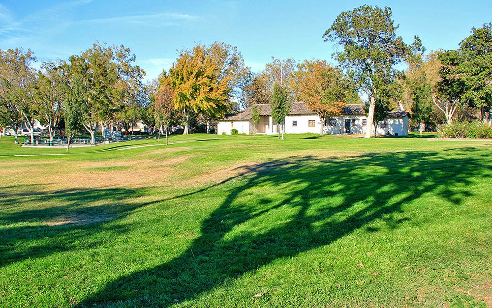
Snyder remembered one more site in Hollister that he urged me to visit on my way out of town.
In the very center of Hollister’s Dunne Park, a nice and gentle swale “like a chaise longue,” in his words, has been developing.
Expecting to find just a small bump running through the park, I was instead surprised to see that there is actually a rather large grassy knoll forming there, a rolling and bucolic hill that few people would otherwise realize is an active tectonic fault.
 [Image: A fault-caused grassy knoll rises in the center of Dunne Park in Hollister; photo by Geoff Manaugh].
In fact, he said, residents have been entirely unperturbed by this mysterious appearance of a brand new landform in the middle of their city, seeing it instead as an opportunity for better sunbathing. Fault creep is not without its benefits, he joked.
Snyder laughed as he described the sight of a dozen people and their beach towels, all angling themselves upward toward the sun, getting tan in a mobile city with the help of plate tectonics.
[Note: An earlier version of this piece was first published on The Daily Beast (where I did not choose the original headline). I owe a huge thanks to Andy Snyder for the phone conversation in which we discussed fault creep; and the book Finding Fault in California: An Earthquake Tourist’s Guide by Susan Elizabeth Hough was also extremely useful. Finally, please also note that, if you do go to Hollister or Hayward to photograph these sites, be mindful of the people who actually live there, as they do not necessarily want crowds of strangers gathering outside their homes].

 [Image: From
 [Images: These are just slightly larger versions of some images
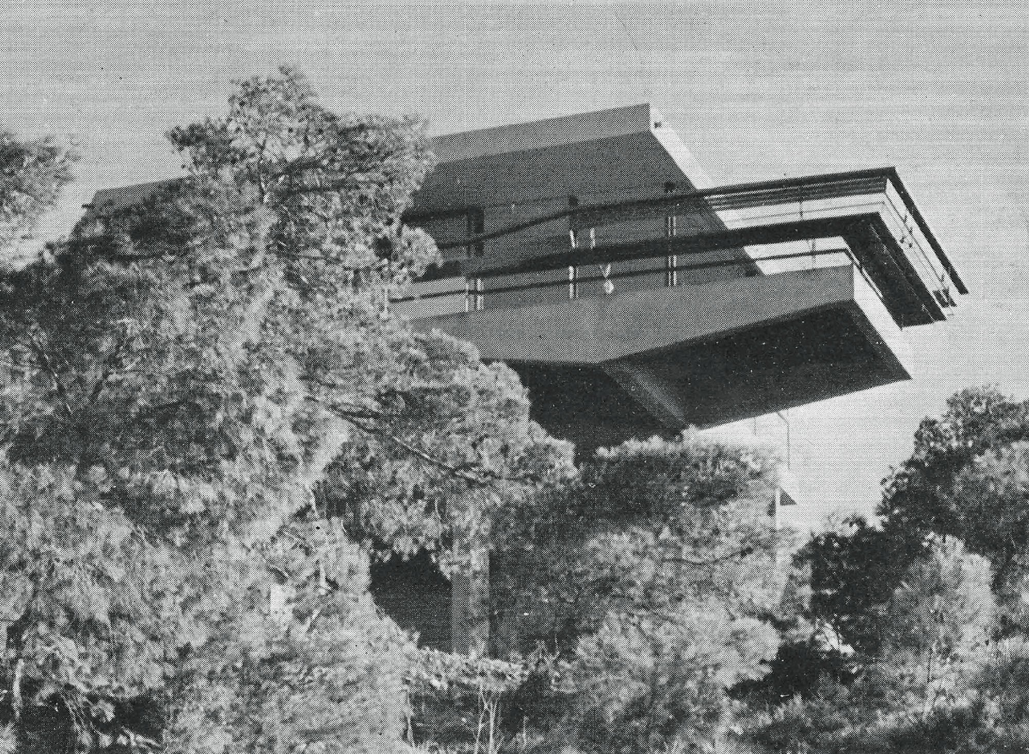
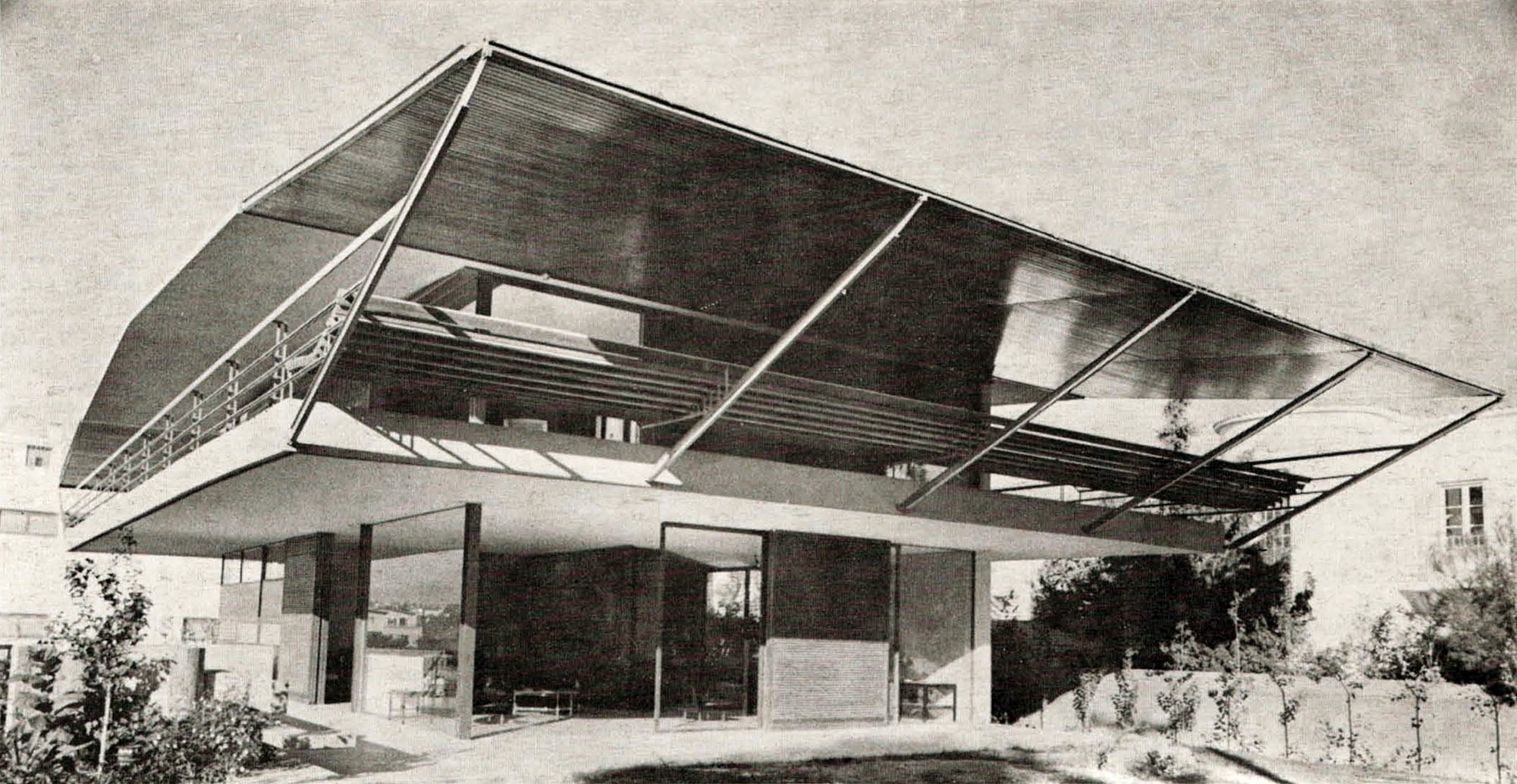 [Image: House by Takis Zenetos (1961) from
 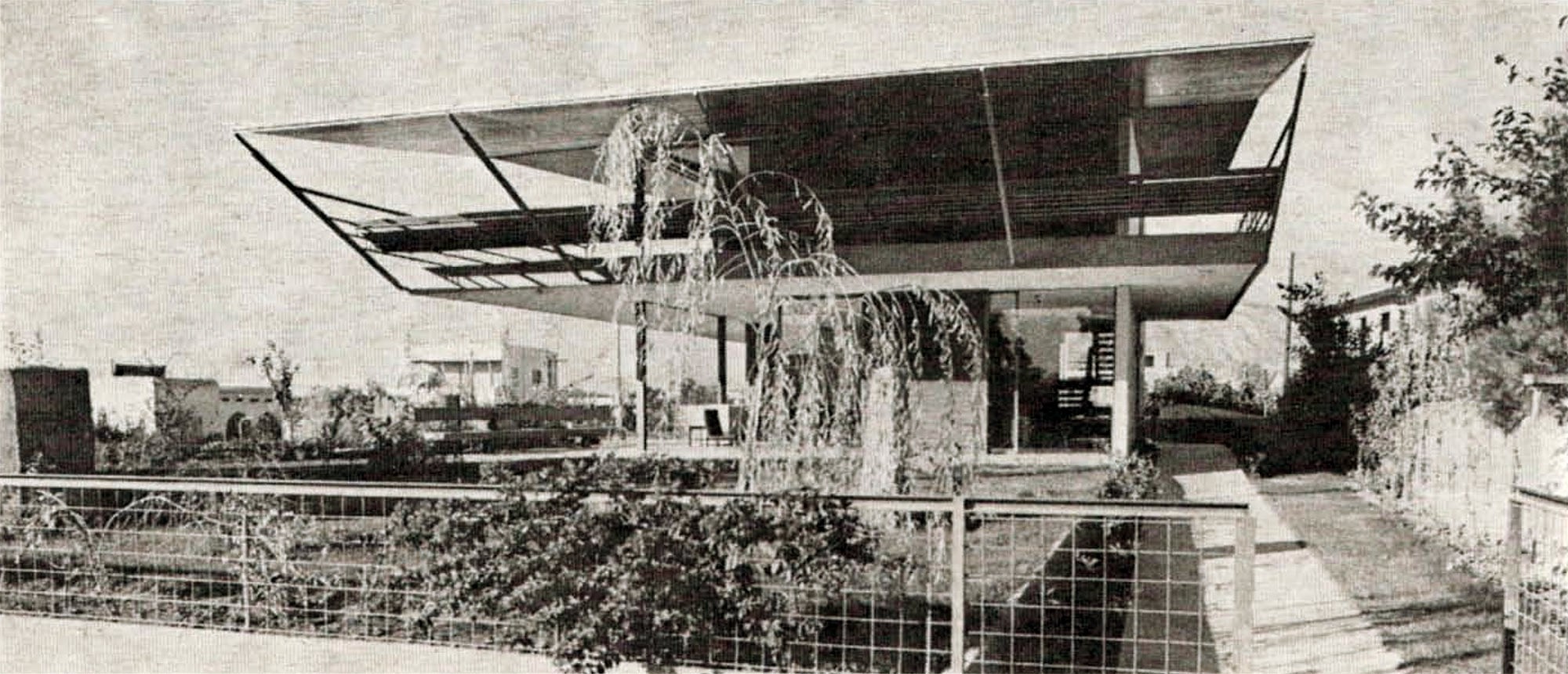 [Image: House by Takis Zenetos (1961) from
 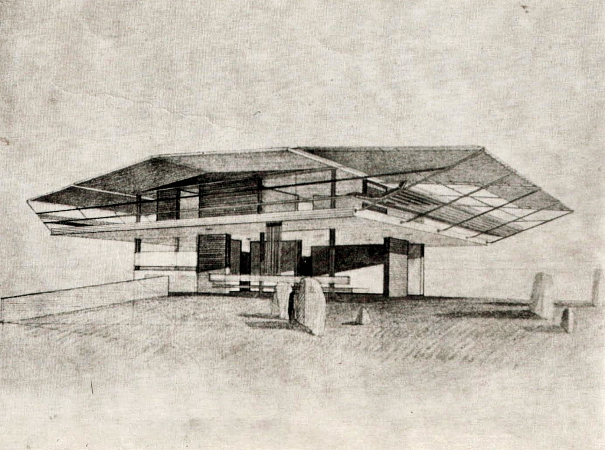 [Image: House by Takis Zenetos (1961) from

 [Images: Another home by Takis Zenetos (1961) from
  [Image: A sketch from 1962 by Takis Zenetos, from
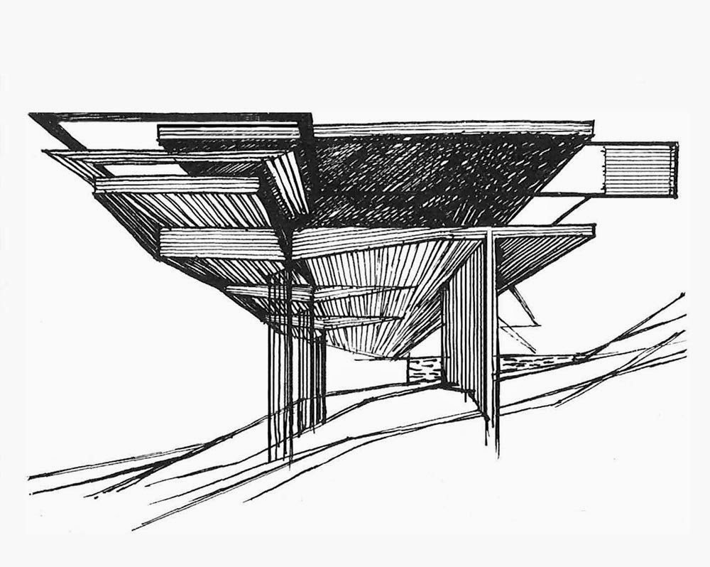
 [Images: House by Takis Zenetos (1959) from
 [Image: A proposal from 1954 by Takis Zenetos, from
  [Image: Alas, I don’t have this in higher res; a proposal from 1954 by Takis Zenetos, from
  [Image: A proposal from 1956 by Takis Zenetos, from
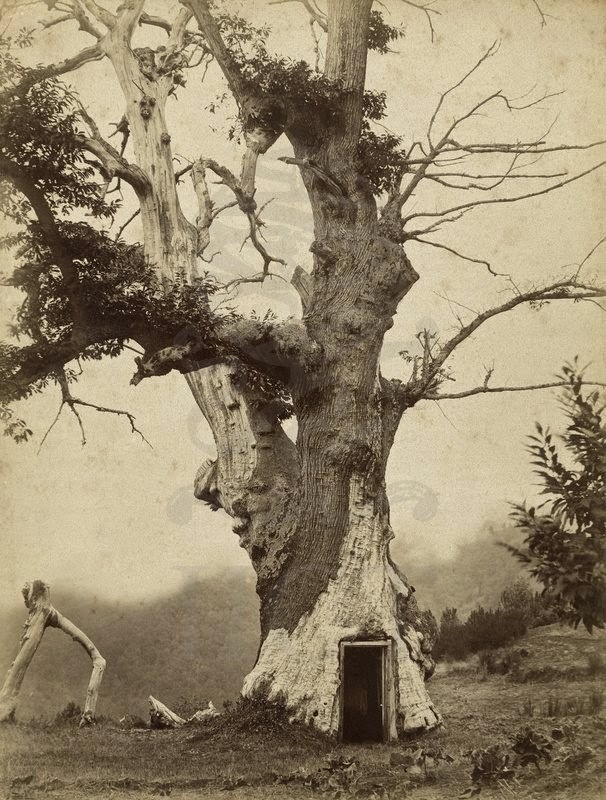 [Image: A tree turned into architecture by the addition of a door. Photo via Tumblr, where it is erroneously described as being
 [Image: From “Midwestern Culture Sampler” by
  [Image: From “Midwestern Culture Sampler” by
  [Image: From “Midwestern Culture Sampler” by
  [Image: From “Midwestern Culture Sampler” by
  [Image: From “Midwestern Culture Sampler” by
  [Image: A ghost of “
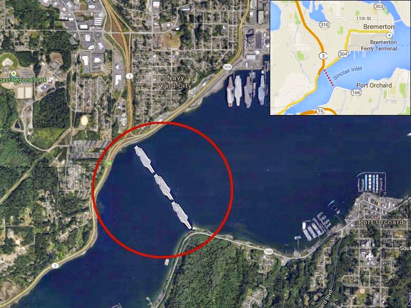 [Image: An “unofficial illustration” of the idea by Huntington Ingalls, via
 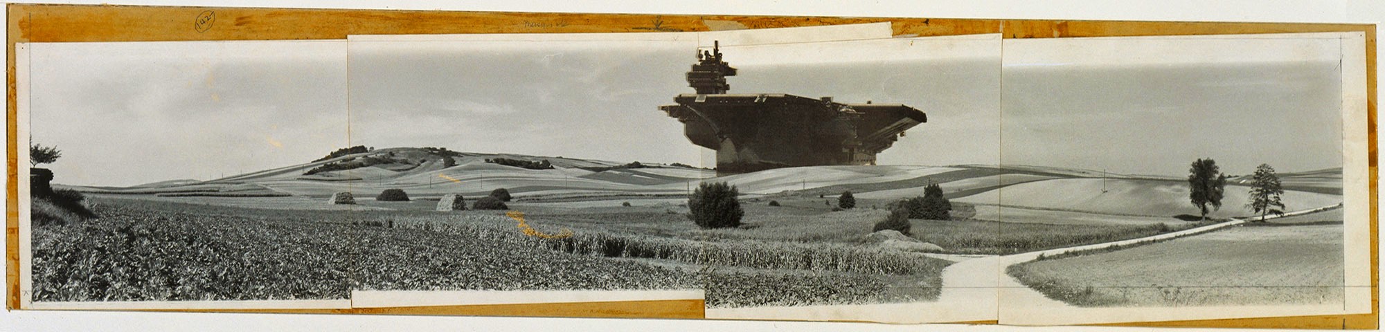 [Image: “Aircraft Carrier City in Landscape, project, Exterior perspective,” by Hans Hollein (1064); via
 [Images: (top)
 [Images: Constant’s New Babylon].
 [Image: “
 [Image: “
 [Image: “
 [Image: By
  [Image: By
  [Image: By
  [Image: By
  [Image: By
  [Image: By
 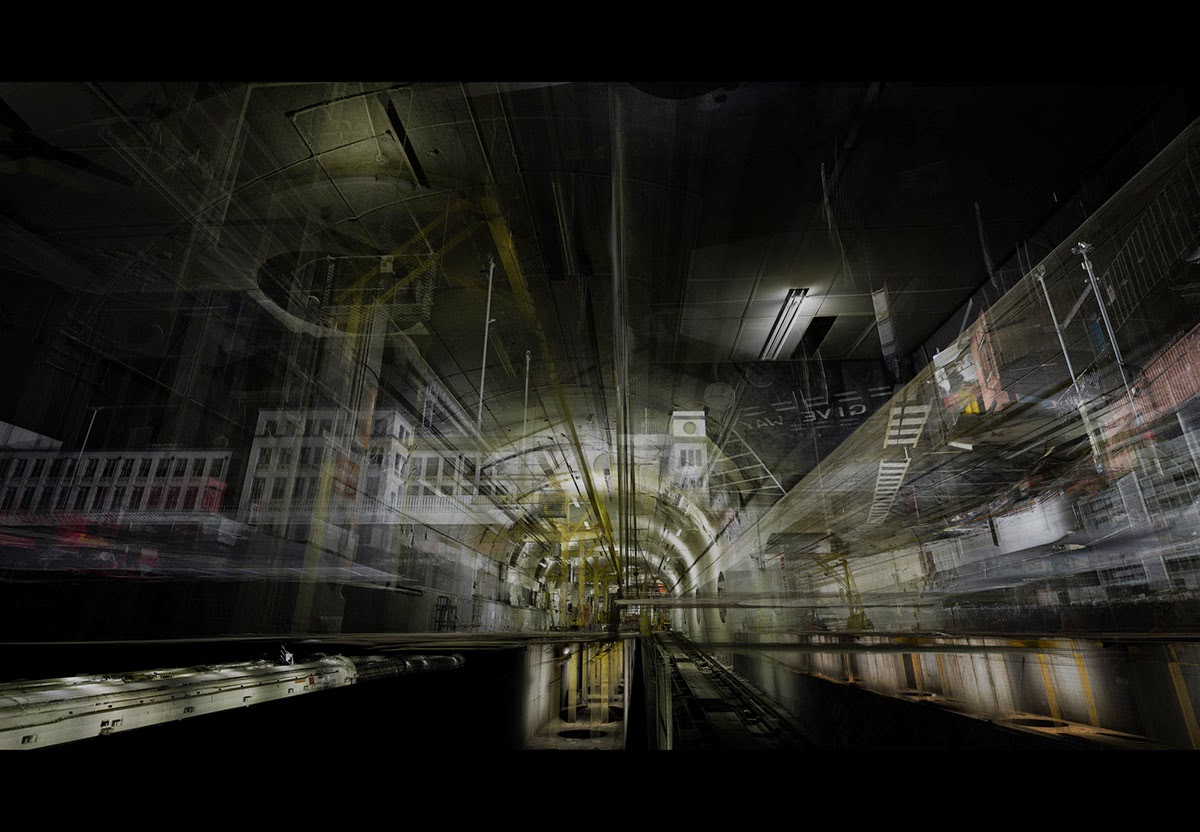 [Image: By
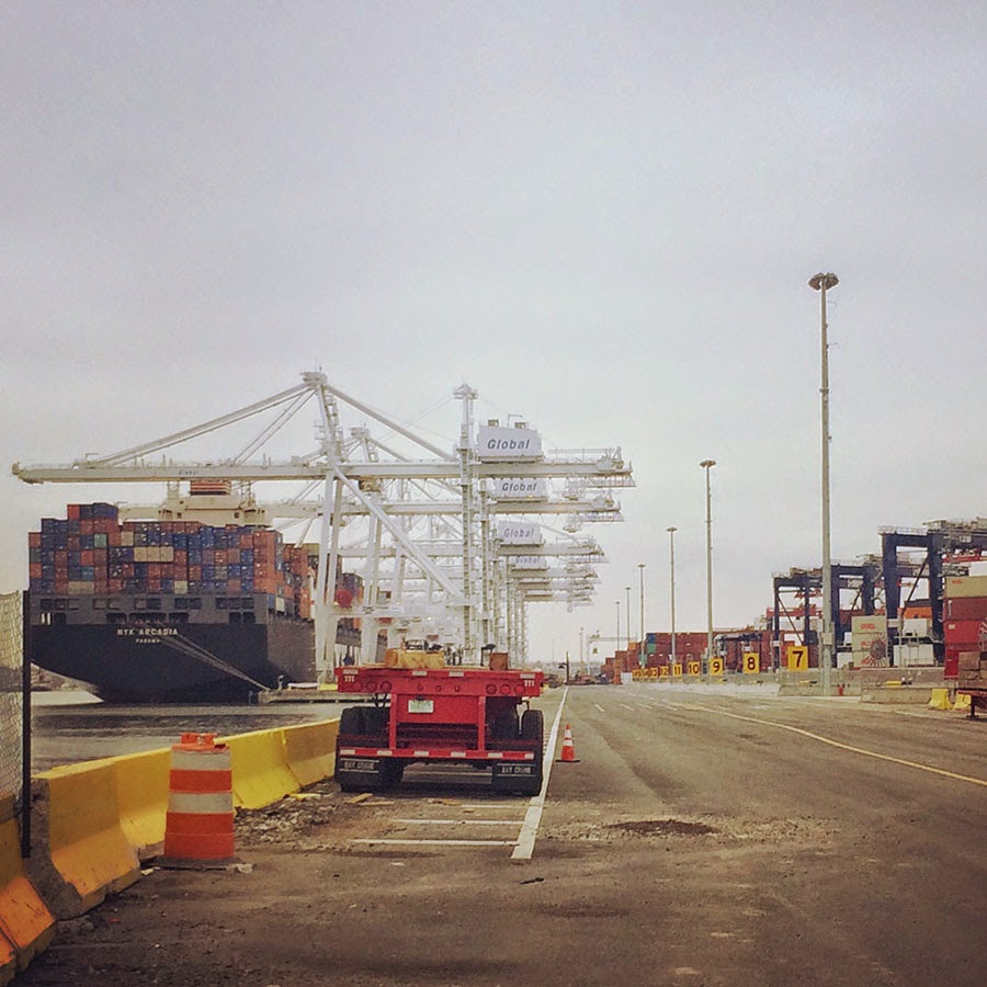 [Image: A view of the
 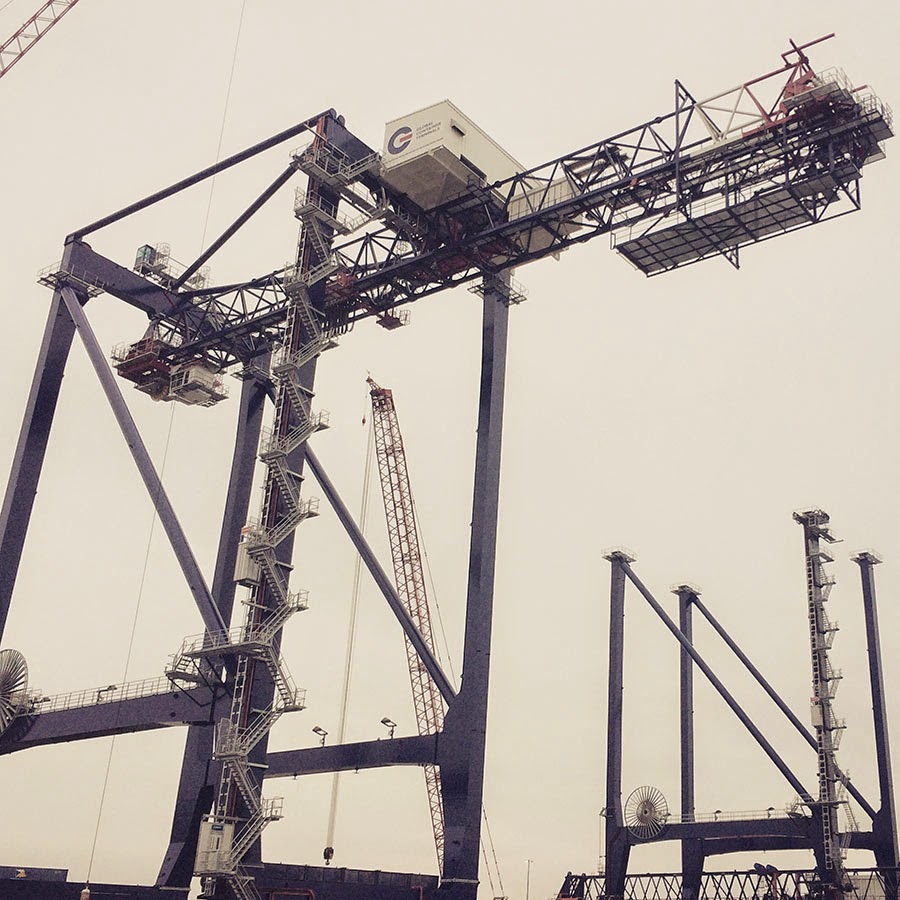 [Image: A crane so large my iPhone basically couldn’t take a picture of it; Instagram by
 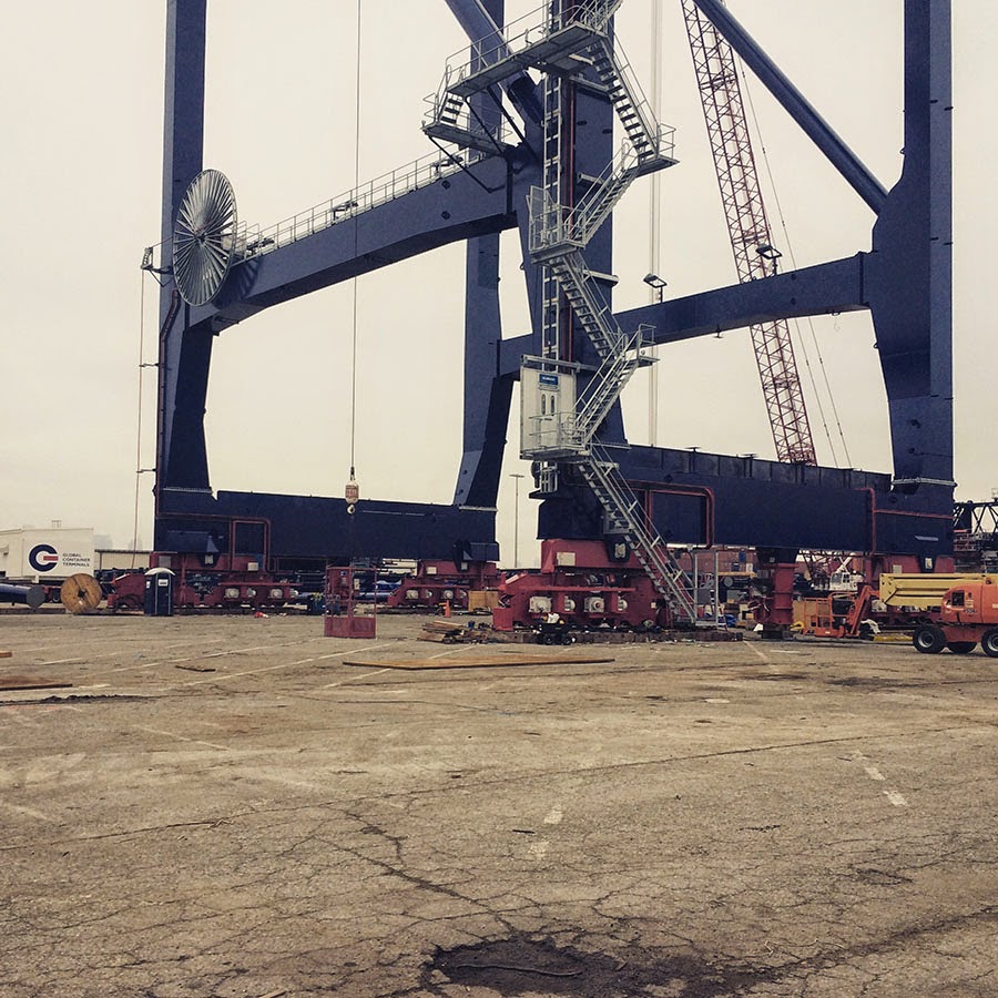 [Images: The bottom half of the same crane; Instagram by
 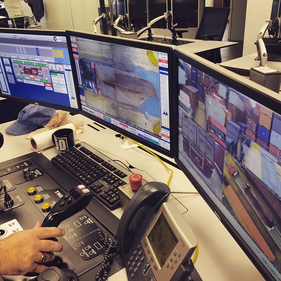 [Image: Waiting for the invisible hand of Auto Schwarzenegger; Instagram by
  [Image: Out in the acreage; Instagram by
 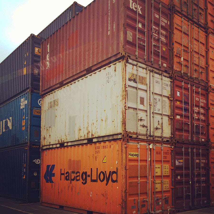 [Image: One of thousands of stacked walls in the infinite labyrinth of the
 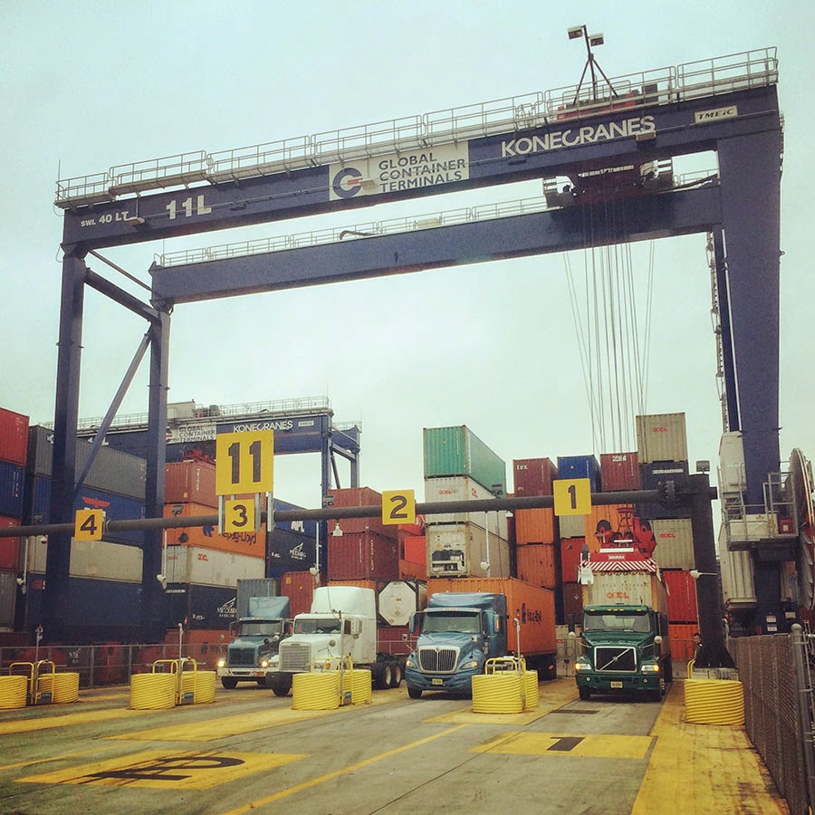 [Image: One of several semi-automated gate stations around the terminal; Instagram by
 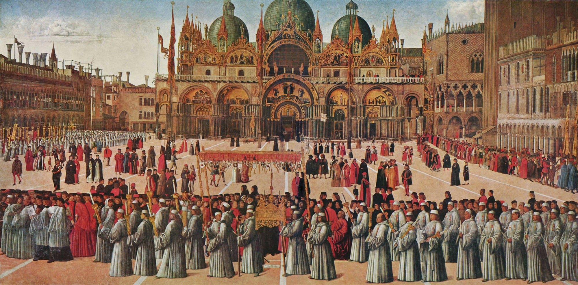 [Image: Procession of the True Cross (1496) by Gentile Bellini, via
  [Image: The Container Guide; Instagram by
 [Image: From
 [Images: From
  [Images: From


 [Images: From
.jpg)